Organic & Synthetic (2002)
Link to final Proposal
Original Thoughts
Materials
Organic: Commercial oil based paints mixed with animal fat and traditional oil paints. Emulsion paints mixed with traditional acrylic/watercolor/gouache paints
Synthetic: Commercial and domestic self-adhesive vinyl tape, cut with a commercial computer based design/cutting program, Signlab v.4.95 software package.
Prediction = the aesthetics of the system + the aesthetics of failure = Prediction
I would find it very easy not to produce any visual work. The aesthetics of painting, the total confusion that it is still in, has devalued this important medium. It is no longer acceptable to follow Duchampian traditions and say that context is a primary factor. To claim something is art is simply not good enough. Duchamp said that a painting/sculpture died after about 40 or 50 years. After that they become Art History. What will historians be saying in 40 or 50 years time?
Unfortunately the problems of fragmentation and confusion that exist within more traditional art practices, such as painting and sculpture (in the broadest possible milieu) are mirrored in new art practices. Within these technological and new media categories, diverse concepts and imagery has been lumped together to form a hodgepodge of non-related methodologies and artworks. What is this direction?
The Changing Language of Prediction and Explanation
There are artworks1, which as art could be mistaken as science/technology. Such works rely on networking, robotics and systems. (You could include Internet works in this category.2 ) When viewing/understanding Artworks that are based on networking, systems, and communities how do you subconsciously and verbally criticize the aesthetic or concept?
The true aesthetics of a system is not the peripheral. The aesthetics of the system is in the understanding of its detail. The true aesthetics of the system incorporates the aesthetics of failure, a system that is reliant on external forces or structure will always have an element of built in probable failure. (This is a prediction.) The only way to achieve total reliability is to have a closed system, this however discourages growth and system expansion and thus becomes a self-fulfilling prophecy. The element of failure is important to the success of a system. (A non-homogeneous system, whose terms and relationships are not constant, allows language to break up, to stumble over the rules of its grammar, by necessity it has to respond radically to other linguistic components, creating a new linguistic order and syntax.3 )
The aesthetics of failure, a crucial component of a system, is not Auto Destructivism; Auto Destructivism is a process where machines (or systems) are built to fail. The parameters of Auto Destructivism include various practices, including painting with acid and fire. The aesthetics of failure is not total destruction; it is the disappointment of failure. The aesthetics of failure, although contained within the framework of prediction can either engender invention or depression. The disappointment felt by painters when the image in the mind is far greater than the image physically in front of them is in reality an exact position. To produce a painting that is better than the image of the mind is to give rise to a product of catastrophe. (To achieve exactness by design and skill is to reach a point of exhaustion and famine.) It is therefore acceptable to assume that an artist that is categorized as a genius has in fact failed more successfully than one who is mediocre.
The challenge that an apprentice required to become a Master is no longer necessary; it is possible to create visual and non-visual works of art without scholarly wisdom or practical experience. However without the foundation of knowledge and skill, the aesthetics of failure cannot be understood. New Media embraces, by its very nature, everything that is innovative. The skills that are required are in many cases prescriptive, an understanding of the aesthetic of the system is not necessary and therefore the ‘imagery’ being produced is becoming predictable, driven by the limitations of the system’s software and not the imagination of the Artist.
New materials and better manufacturing techniques have resulted in more intense colors. Commercial paint, even though Jackson Pollock used it (and I used it) in the last century, has developed into the preferred paint medium for some painters. Technology has also provided us with new exciting materials and different ways to use them.
I am using vinyl, a material I have used commercially, as my preferred medium. The “plasticness” of commercial vinyl tapes, their tactile and glossy qualities make them vibrant and alive; when juxtaposed against natural materials or organic shapes and colors they become a contradiction, a complement, more intense and more synthetic……which is similar to Frank Stella’s work during the 1980’s4 . I have carried out experiments with this vinyl material; I have cut and slashed it to destruction, to gain a better understanding of the inherent stability of this medium. I have rejected the possibilities of cutting out images and shapes by hand…..the aesthetics of the system is more important.
I have subcontracted out my creativity to a computer stencil cutter… this is what I did with machine lithography in 1978/79….I have given the computer cutter more responsibility. The lack of total control is maybe a step towards originality? The fine line that exists between the system successfully (in a commercial sense) succeeding to producing a perfect graphic that can be understood as signage and total failure…where the machine totally becomes auto destructive, is microscopic. By understanding the computer program’s limitations I can exploit its weaknesses. By working out paintings on the computer I can tease the system to fail, bringing into play the aesthetics of failure.
Basic Prediction
Horoscopes in newspapers are based on star signs and birth dates; these predict the day’s events. These predictions are based on the laws of probability and chance. You could read your daily horoscope and make the prediction into a self-fulfilling prophecy, you could go out and find that ‘Tall dark handsome man’ or go on ‘A long journey’. Alternatively you could read your horoscope late in the evening and interpret the day’s events and adapt them to the mystical words. “Yes I did meet someone important today”. The interesting thing about prediction is that you could meet a tall dark handsome man, go on a long journey and meet someone important and never read your horoscope. Does this mean the day’s events were not predicted? Similarly these rules can apply to system-based art and painting.
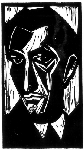
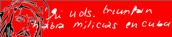
Title: ‘Self Portrait in Red’
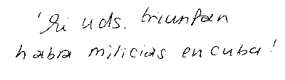
The image above is a proposal for a painting whose width is 20 metres and is derived from the source material below. Costs to produce approximately £10,000 to £12,500.
Politics = the aesthetics of the system + the aesthetics of failure = Politics
The billboards around Cuba proclaim Revolution; the heroic gestures of Cuban heroes symbolize the power of Revolution. Cuba is still in a politicized state of revolution, a religion of the state. Che looks like Christ.
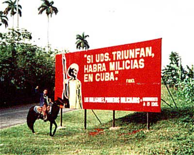
Dr. Alisha Kaliciak who I met riding with vaqueros in Cuba took the photograph above. The text on the proposed painting has been written by her and scanned into my system. She is in many respects the creator of the image and her handwriting will sign it. My role is to program it into the system and to make the final formal choices.
The red background will be painted in red paint (see materials above) with techniques that are employed in traditional sign writing. (This is knowledge I gained from working for a sign writer in Exeter)
Prediction: the text will be difficult to read, through the system distorting the handwritten quote.
Prediction: the iconic image will be difficult understand, through the system distorting the small graphic.
Prediction: the finished image will not function as a billboard.
Notes: The image of Christ is in fact a metaphor, the finished image should be viewed as a self-portrait. This head of Christ is a design that I adapted for commercial use within the monumental memorial trade (it is based on an American design) and has been copied by system suppliers (for the stone industry) and used as a ‘stock design’ within their software packages. As an artist, who believes in open networks, I am proud of this little iconic image even though I cannot claim its originality. Likewise the use of handwriting is not a new idea for me; during the 1970’s I was fascinated by shorthand and the power secretaries had…understanding a simplified language. During the 1980’s I won a design award (The Crown Memorial Design Award) for the most original memorial design. The design was a simple block of black granite with the signature of the deceased on it.
Link to final Proposal
Disclaimer
This text is subject to prescriptive/predictive rules of a system aesthetic. This text has been written on four computers, two of which are on a network and two of which are stand-alone systems. Each computer is running a different version of a Windows operating systems, (Windows 95, Windows 98, Windows ME and Windows XP). The text is written in Microsoft Word, three are using version 2000 and one is version 97. Three versions are operating with an English dictionary and one (v.2000) is using an American/English dictionary. This text has been written in two locations, my homes in Bromsgrove and Woolacombe. This text has been subject to 100’s of system protocols, however the structure of the text is predictable; each computer has its own subtle nuances and offers syntax and grammatical recommendations. I am not completely responsible for this text, my systems are. My main contribution is editing and using the cut and paste facility. If I had attempted to write this in its finished running order, it would have taken me longer to write…my spelling is appalling and my grasp of grammar is minimal…the written word is not my preferred method of expression. This text would not exist without the existence of the system.
This page has been created in a non ‘web-prescriptive’ manor. The use of Times New Roman font is a positive reaction to the web’s political and aesthetic values. I do not wish to be cool and use prescriptive methods of page creation. I have written this in ‘Word’ (one of the most frowned upon web-prescriptive creative tools) and not Dreamweaver or any other trendy formulaic program…..I do not want to be a part of the web’s system of aesthetics. (However if you look at the ‘source’ the urge to fiddle with the code was irresistible. This was done in notepad. I have made this page unstable.)
I do not encourage the use of pirated or hacked software.
Related articles


- The art of marketing art (sitemaps-xml.com)
- Morgue Gallery – Prices (morguegallery.com)
- BA(hons) degree from Exeter College of Art and Design in #Printmaking (thiswindow.org)
- Commercial oil based paints mixed with animal fat – In private collection This painting was painted around 2002 / 03 by Peter Bright I hadn’t seen this painting for nearly 10 years – until yesterday… Prediction = the aesthetics of the system + the aesthetics of failure = Prediction.